SaaS Product Screenshots: How to Make the Value Visible
Turn a crowded SaaS screenshot into a useful product explanation. Check the crop, annotations, evidence, mobile readability, and image performance.
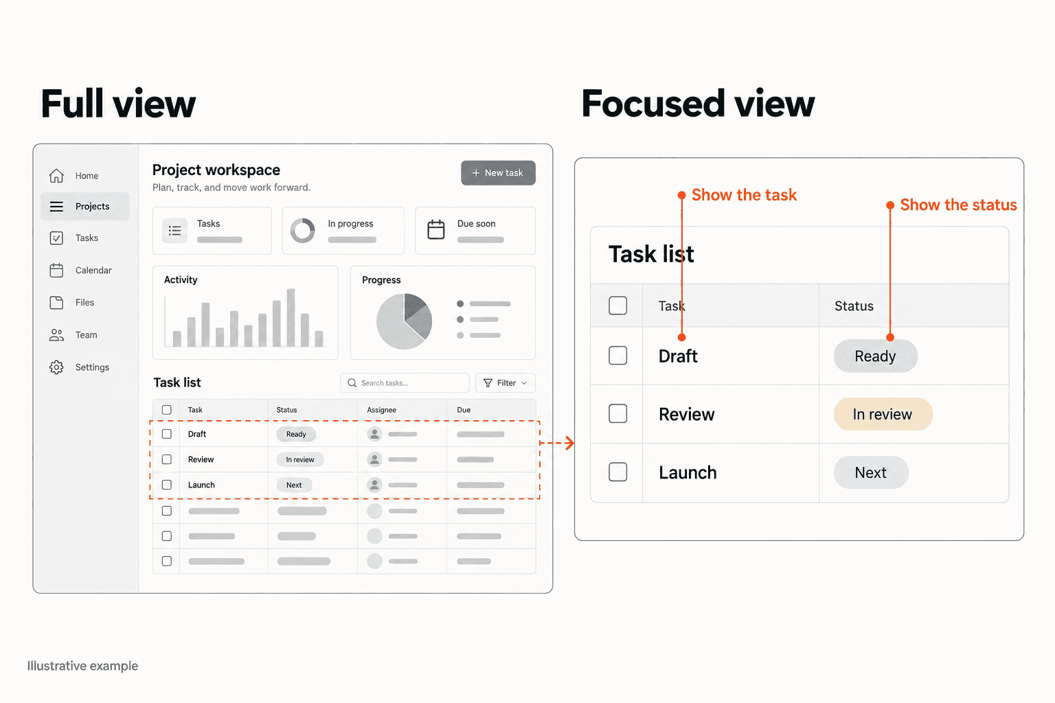
Your landing page has a large product screenshot. It looks polished, fills the hero, and shows that the software exists. But a new visitor still cannot explain what they would do with it.
A screenshot records an interface. It becomes useful sales material when the reader can connect something visible to a task they care about. A dashboard full of tiny cards can leave that connection completely unstated.
Start by auditing the image as an explanation: what question does it answer, what should the visitor notice, and what does it actually prove? This guide shows how to choose, crop, annotate, and check SaaS product screenshots without turning sample data into fictional customer results.
1. Give each screenshot one buyer question to answer
Before opening a design tool, finish this sentence: after seeing this image, a visitor should understand how to ____. Good answers name a task: find overdue approvals, compare two page versions, or export a report for a client. 'Understand our platform' is too broad to guide a crop.
The question should fit the surrounding copy. If the heading promises a faster way to review invoices, a revenue dashboard introduces a different story. The visitor has to invent the missing connection between the claim and the interface.
Choose the screen where the promised capability becomes visible. A settings page may prove that a configuration exists, but it rarely explains the output. Sometimes two small frames, showing input and resulting output, are clearer than the application's default overview. Keep enough context to show how they relate.
- Name the reader's task before choosing the screen.
- Write the image's intended takeaway in one sentence.
- Check that the heading and visible interface describe the same capability.
Fix
Remove or replace a screenshot if you cannot explain what useful uncertainty it resolves.
If the image and headline tell different stories, review the whole first screen together.
Audit your landing page hero2. Crop around the task, then restore the missing context
Consider QueueBoard, a fictional approval tool used only for this example. Its original landing page shows an entire workspace: navigation, a welcome banner, eight summary cards, a table, and an activity feed. The accompanying headline says 'Find the approval holding up your project.' The relevant row occupies a tiny part of the image.
A useful revision crops to the approval queue, retaining its title and column labels. One fictional row reads 'Packaging artwork', with 'Awaiting finance' as its status and 'Maya' as its owner. A modest outline identifies that row. The image now gives the reader a place to look and a reason to look there.
The caption explains the relationship: 'The approval queue brings the pending item, responsible person, and current status into one view. Fictional product and sample data.' It does not claim time saved or faster launches. Those outcomes are not established by a screenshot.
Cropping has a limit. Removing the column headings could make the owner and status ambiguous. Removing a prerequisite filter could imply that the same view appears automatically. Preserve the context that changes the meaning of what is shown.
Fix
Start with the smallest honest crop that makes the promised task understandable.
3. Use annotations to explain a relationship
Annotations should point out what an unfamiliar reader might miss. In QueueBoard, 'Current owner' explains the person column. 'Every detail in one place' adds little because it neither identifies a detail nor explains how the interface supports the claim.
Start with one callout. Add another only if the first leaves an important question unanswered. Arrows, rings, and numbered markers become competing instructions when every element gets one. A viewer should be able to find the highlighted detail before reading a paragraph of explanation.
Keep marketing annotations visually separate from the product interface. Otherwise readers may expect a capability or label that does not exist in the actual product. Put the explanation outside the screen or use an unmistakable editorial callout style.
Use the caption for the implication and any necessary qualification. 'Approval queue' merely names the screen. 'See who owns each pending approval before opening individual projects' explains a useful action, provided the screenshot and product genuinely support it.
Fix
Delete labels that repeat the heading and keep labels that help interpret something visible.
4. Separate a product demonstration from customer evidence
A screenshot can demonstrate interface structure and an available capability. Sample entries do not establish real adoption, customer revenue, or a typical result. A rising chart with invented data is still invented data when it appears inside a realistic dashboard.
Use a dedicated demonstration account with invented names and clearly labeled sample data when real customer information is unnecessary. Check the entire capture for email addresses, private projects, browser tabs, and other details outside the intended crop. Hiding a name does not necessarily remove everything that could identify the account.
If a visual shows a planned interface, label it as a concept. If it shows a feature available only on a particular plan, place that qualification beside the image. A beautiful screenshot creates the wrong expectation when the visitor cannot access what it shows.
For genuine customer evidence, document permission, the capture date, and the context of the result. Keep those records with the source asset so a later editor can check the caption.
Fix
Label the evidence type before polishing the image: live product, demonstration data, concept, or documented customer result.
When an image is meant to build trust, check the surrounding evidence and qualifications too.
Review your page's proof5. Check the explanation at its actual mobile size
A sharp source file can still become unreadable when a desktop workspace shrinks into a phone-width column. Open the published page on a narrow screen and read the exact detail the image is supposed to communicate. Do this at ordinary viewing size, without starting with a pinch to zoom.
If the key detail disappears, use a closer crop for mobile, place the caption immediately below it, or split a sequence into separate frames. Enlarging the same crowded overview may simply replace tiny text with awkward scrolling. Check that any alternate crop preserves the original meaning.
W3C's informative-image guidance says the text alternative should communicate the image's relevant meaning. For QueueBoard, an appropriate description could be 'Approval queue showing the pending artwork, its finance status, and assigned owner.' Essential explanations also belong in visible text so readers do not have to decode the image to understand the offer.
- Read the highlighted content at the rendered size.
- Check that labels remain connected to their targets.
- Make the claim understandable when the image cannot be seen.
Fix
Treat mobile readability as a composition problem before increasing export resolution.
6. Make the explanation load when the reader needs it
The best crop does no work while it is missing. Review the published page on a fresh load, with a constrained connection as well as your normal connection. Watch for a large blank area, a late image reveal, and text that becomes soft after compression.
Google's web.dev guidance recommends identifying the actual Largest Contentful Paint element before changing loading behavior. If your screenshot is that element, lazy loading delays the resource unnecessarily. The guide also explains that a smaller file alone may not fix the problem when scripts or other rendering delays keep the image hidden.
Ask your developer to inspect the image request and rendered dimensions, then test an export appropriate to the displayed size. Compare fine interface text in the browser, not just the file size. Below-the-fold supporting screenshots can have a different loading strategy from the principal image at the top.
Fix
Verify which image affects the initial experience, then optimize that image without losing legibility.
7. Test understanding before commissioning more visuals
Show the revised section to someone unfamiliar with the product. Ask what task the product helps with, what detail in the image supports that answer, and what remains unclear. Let them respond before explaining the interface yourself. If your explanation supplies the missing connection, the section still needs work.
Keep the test focused. Compare the original full workspace with the proposed crop under the same heading. Record specific misunderstandings: 'I thought this was a chat tool' is useful; 'the second one feels cleaner' is less diagnostic. This is a comprehension check, not proof of a conversion lift.
Maintain an asset note containing the product version, capture date, demonstration-data status, page location, and responsible editor. Revisit screenshots when the interface, plan availability, or adjacent claim changes. Old product visuals can quietly contradict current onboarding and sales conversations.
Fix
Fix the first misunderstanding, then repeat the comprehension check before adding another screenshot.
Once the screenshot communicates clearly, use the broader checklist to review the rest of the page.
Check the full landing pageCheck your own page
Does your page make the product understandable?
Submit your public landing page to Improve My Page for an audit of page clarity, proof, CTA specificity, and technical signals. Use the findings to prioritize the next correction.
Audit your landing pageSummary
| Problem | Diagnostic signal | Fix |
|---|---|---|
| Crowded overview | The important action is a tiny part of the image | Crop around one buyer task and retain its context |
| Decorative annotations | Callouts repeat general marketing claims | Explain a visible detail or relationship |
| Unclear evidence | Sample figures look like customer results | Label demonstration data and qualify availability |
| Unreadable mobile image | The claim depends on text that requires zooming | Use a closer crop and a useful text explanation |
| Late main screenshot | The central visual arrives after the surrounding content | Inspect the actual loading bottleneck and verify the rendered result |
A useful SaaS screenshot connects a buyer's question to something they can see. Start with that connection, then choose the crop, annotations, and caption that make it understandable.
Correct a misleading or unreadable image before investing in more visual polish. A modest, accurate demonstration does a more useful job than a beautiful screen the visitor cannot interpret.
FAQ
How many product screenshots should a SaaS landing page have?
Use enough to answer distinct buyer questions. Start with one clear demonstration of the central task, then add supporting images only where they explain something the first cannot.
Should I show the entire product interface?
Show it when the overall structure matters. For a specific capability, a closer crop usually makes the relevant detail easier to inspect. Retain labels and prerequisites that affect the meaning.
Can I use sample data in a product screenshot?
Yes. Label it as demonstration data and avoid presenting it as measured customer performance. A dedicated sample account can explain the product without exposing private customer information.
Should screenshots have alt text and captions?
Informative screenshots need an appropriate text alternative. Add a visible caption when context, a qualification, or an explanation helps everyone understand the image. The two texts can serve different purposes.
Is a video better than a screenshot?
Use video when the sequence or motion is necessary to understand the task. A static image may be sufficient for a result or view. Keep the main promise understandable without requiring video playback.
How can I tell whether the new screenshot works?
First check whether unfamiliar readers understand the intended task. If you later measure business impact, use appropriate analytics and a sound comparison. Clearer comprehension alone does not establish higher sales.