A blog index serves a different intent from a product landing page. Some visitors want help with one problem; others are ready to apply that help. The page needs a useful route for both.
We reviewed our own public blog index on September 17, 2026. The first screen makes the audit action prominent, while the first article begins lower down. That is an observable layout choice, not proof that readers abandon the page.
- Keep
- The direct connection between reading advice and auditing a page.
- Test
- Show a useful guide choice earlier, alongside the audit option.
- Verify
- Readers can choose a guide and understand the audit commitment.
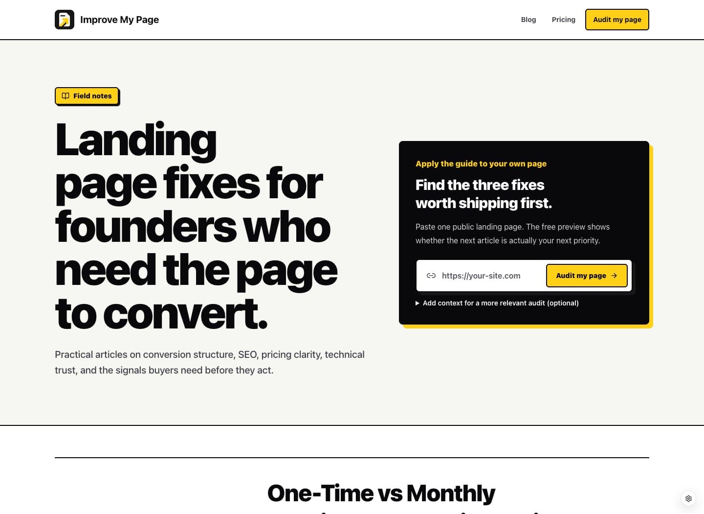
First-party blog-index review at 1440 × 1050. Optional cookies rejected. Article ordering and the public audit panel inspected; no audit submission, mobile usability test, or conversion analysis performed.
Give the reader a visible route into the guides
At the reviewed desktop size, a large editorial headline and dark audit panel fill most of the opening screen. The first featured article begins beneath that block. The layout tells us the product action receives earlier visual emphasis than article selection.
Test a more compact introduction with a clearly labeled route to the guides. Keep the audit available, but let visitors recognize that reading is also a supported next step. Compare this with the current layout before deciding that an immediate product form is the best use of the opening screen.
Carry the audit expectations into the blog form
The blog panel explains that the preview is free and offers optional context fields. Unlike the homepage form, the captured panel does not include the nearby email-confirmation explanation or full-report price. Readers should not need a separate homepage visit to understand those next steps.
Add one short line explaining that email confirmation starts the audit and that the full report is a paid option. Keep it close enough to the submit button to inform the decision. Verify the current offer before inserting a price; avoid maintaining conflicting commercial details across entry points.
Organize the first choice around the visitor’s problem
The index uses a latest-guide feature followed by a dated list. Recency is useful, but it does not necessarily identify the best starting point for a visitor struggling with a form, pricing explanation, or unclear CTA.
A small set of existing guide links can offer that route without creating another article. Use descriptive labels that match real reader problems. Keep the complete chronological list for returning visitors, and choose links because they resolve distinct questions rather than because every page needs more links.
- Unclear next step: point to the CTA examples.
- Form hesitation: point to the form checklist.
- Buying uncertainty: point to the pricing checklist.
Count useful reading as well as immediate audits
First check whether a new visitor can find a relevant guide without guessing. Then test the same task on mobile, where the hero, form, and article list can require more scrolling. This review’s screenshot establishes only the desktop arrangement.
For measurement, follow guide selection and later audit completion alongside direct form submissions. Separate visitors arriving to read from visitors returning to use the product. A lower immediate CTA rate could accompany better discovery; neither result should be judged from one isolated click metric.
Questions before you change it
Should a blog index have a product CTA?
Yes, when it offers a relevant next step. It should coexist with a clear reading path and explain the commitment accurately.
Does a guide below the fold prove the layout is wrong?
No. Position is an observation. Whether moving it helps depends on visitor intent, comprehension, and subsequent behavior. The proposed change needs validation.
Would you add a new article for every problem?
Start by linking the useful articles you already have. Create another page only when the question, evidence, and practical answer are meaningfully different.
Make the next fix about your page.
Paste one public page to get a free audit preview. See the priorities, then decide whether to unlock the full report and implementation brief.