A free audit offer creates two decisions: whether to submit a page, and whether the complete report is worth buying. The landing page should make both understandable before a visitor invests time.
This is a first-party review of our own homepage on September 17, 2026. We can inspect the promise and presentation; this review does not claim that the layout caused a particular signup rate or revenue result.
- Keep
- A real deliverable example beside the submission form.
- Test
- A more explicit description of what the free preview contains.
- Verify
- Visitors understand the email step and the paid boundary.
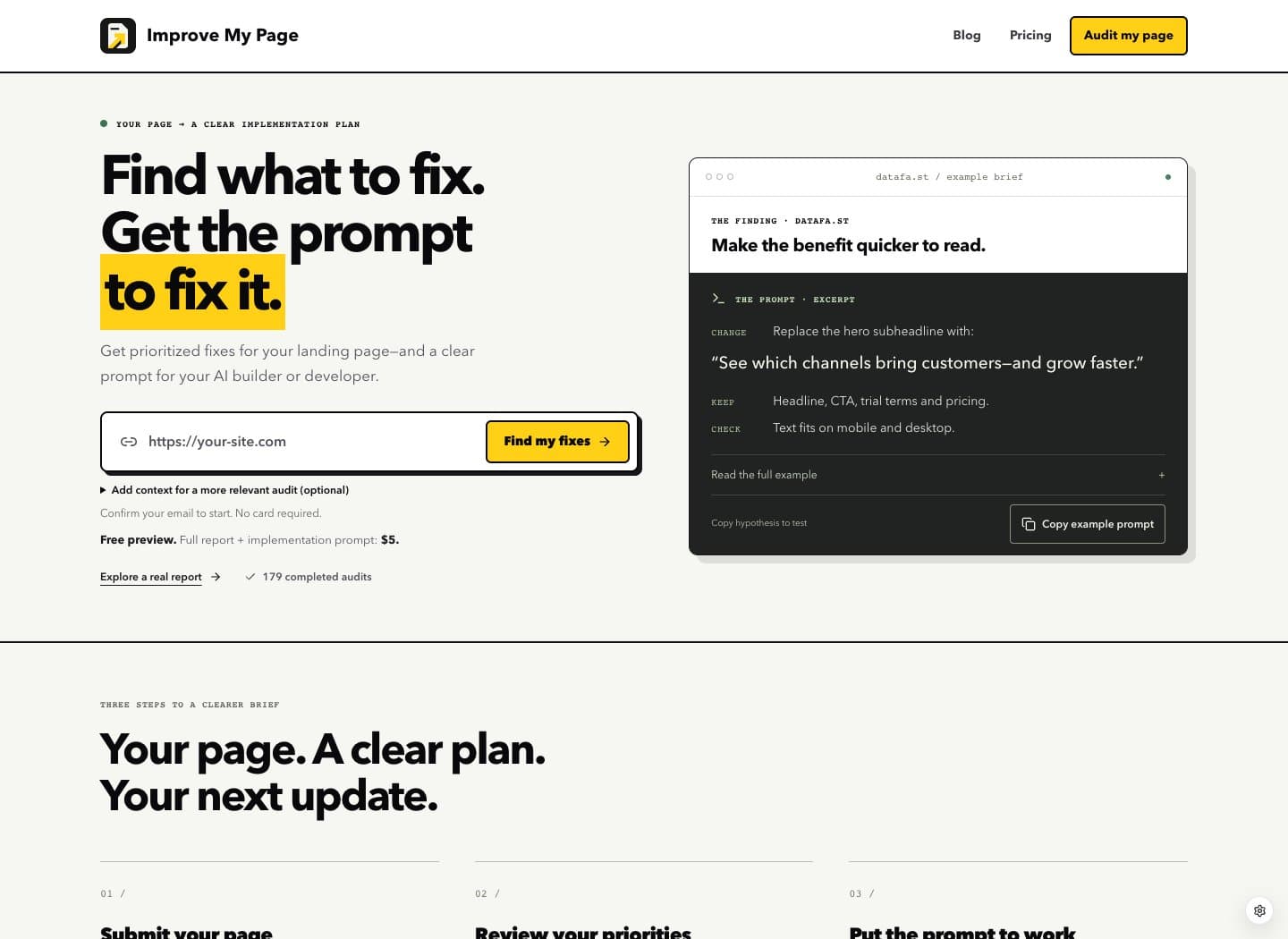
First-party desktop homepage review at 1440 × 1050. Optional cookies rejected. No form submission, purchase, analytics analysis, or new automated audit was performed.
Show the output before asking for the input
The hero pairs the URL form with a specific copy suggestion and an implementation-prompt excerpt. Its change, preserve, and check instructions make the deliverable tangible. This is more informative than an isolated report score for someone deciding what they will do with the result.
Keep that relationship when revising an audit-tool page: one observed problem, one suggested change, and one acceptance check. A representative example should show the scope of the work without implying that a small copy edit is every customer’s highest priority.
Explain the preview in terms of what the visitor receives
Below the first form, the page states that the preview is free and the complete report plus implementation prompt costs $5. The price is disclosed before submission. The remaining clarity opportunity is to define “preview” at the same decision point.
Test a short description of the included verdict and visible priorities. Keep the paid deliverables explicit. This lets visitors judge the offer before entering the flow, and avoids making the full implementation prompt sound like part of the free tier.
Offer explanation to test
Before
Free preview. Full report + implementation prompt: $5.
Suggested change
Free preview: your verdict and visible priorities. Complete fix list + implementation prompt: $5.
Proposed wording only. Confirm the current preview entitlement and price before using it; this resource preserves the dated observation.
Preserve the email expectation beside the button
The hero explains that email confirmation comes before the audit starts and that a card is unnecessary. Optional audience and goal fields sit behind a disclosure. These details distinguish the required next step from context that can improve the review.
After a wording change, verify that a visitor can still tell which information is required. Follow the URL through the next screen without retyping it, and check that the email explanation remains readable at narrow widths. Treat these as acceptance checks for a future change; this teardown did not submit an audit.
Measure the handoff, not the visual preference
Start with the preview explanation rather than replacing the whole hero. Ask new visitors to describe the free result, the paid result, and the next action. Their answers reveal whether the commercial boundary is clear.
For a live experiment, connect form submissions to confirmed audits, completed previews, and eventual unlocks. A more attractive button is not a sufficient outcome if expectations become less accurate. Keep traffic source and the offer consistent enough to interpret the comparison.
Questions before you change it
Why review your own landing page?
It gives us a public, inspectable example whose limitations and product access rules we can explain directly. It is a first-party editorial critique, not an independent endorsement.
Is the proposed preview wording already live?
No. The screenshot records the observed homepage. The replacement is a suggestion to validate, not a before-and-after result.
Does an audit automatically change the website?
No. The report provides recommendations and implementation instructions. The owner or their developer reviews and applies changes separately.
Make the next fix about your page.
Paste one public page to get a free audit preview. See the priorities, then decide whether to unlock the full report and implementation brief.